
Purpose of the article: The purpose of this blog is to educate email developers on the CSS properties blocked by Outlook Mail, offering practical workarounds and best practices to ensure their emails render correctly and look great across all email clients, particularly Outlook.
Intended Audience: Web Developer, Front-end Developer
Tools and Technology: None
Keywords: Outlook Mail CSS, Email design, CSS properties blocked by Outlook, Email client compatibility, VML for emails, MSO conditionals, Email layout best practices, Responsive email design, Inline CSS for emails, Email rendering issues, Background images in emails, Custom fonts in emails, Media queries in emails, Flexbox and Grid in emails.
Introduction:
When designing emails, one of the significant challenges faced by developers is ensuring that their beautiful and meticulously crafted styles render correctly across all email clients. Outlook handles CSS properties stringently. Understanding which properties are blocked by Outlook Mail can save a lot of time and effort, ensuring your emails look great no matter where they are viewed.
The Importance of Email Client Compatibility
It is essential to understand why email client compatibility matters. Unlike web browsers, which largely adhere to standardized HTML and CSS rules, email clients have varied support levels for these technologies. This discrepancy means that an email perfectly styled in Gmail or Apple Mail might look broken in Outlook. Since many users rely on Outlook, especially in corporate environments, ensuring compatibility is crucial.

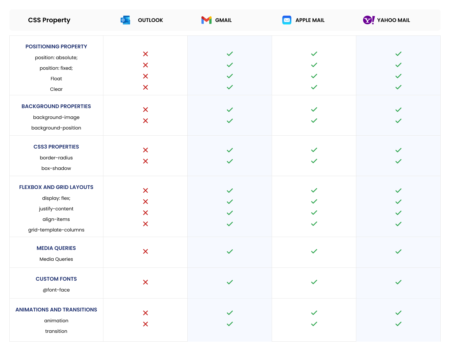
CSS Properties Commonly Blocked by Outlook
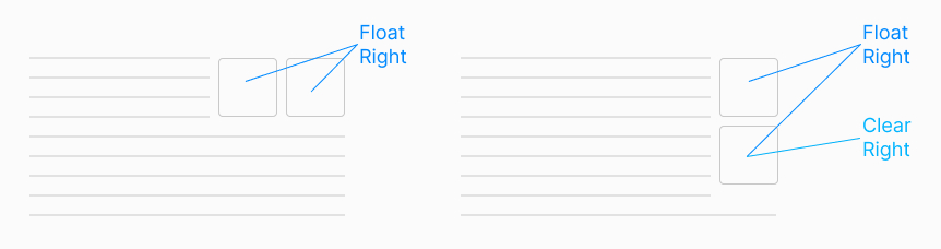
- Positioning Properties (position, float, clear)
- ‘position: absolute;’ and ‘position: fixed;’ are generally ignored by Outlook. This makes it challenging to create layouts that rely on absolute positioning.
- ‘float’ and ‘clear’ also suffer from inconsistent support, making floating elements unreliable.
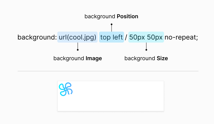
- Background Properties
- ‘background-image’: Outlook does not support background images applied via CSS. To include background images, developers often use VML (Vector Markup Language) as a workaround for Outlook.
- ‘background-position’: Similar to background images, setting the position of background elements can be problematic.
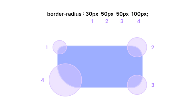
- CSS3 Properties
- ‘border-radius’: Rounded corners are not supported, so elements with this property will render without rounded edges.
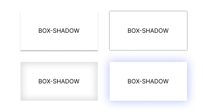
- ‘box-shadow’: Shadows around elements are ignored, making any design relying on shadow effects look flat.
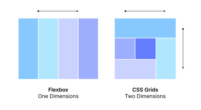
- Flexbox and Grid Layouts
- Both Flexbox and Grid properties are not supported by Outlook. This includes all related properties like ‘display: flex;’, ‘justify-content’, ‘align-items’, and grid-specific properties like ‘grid-template-columns’.
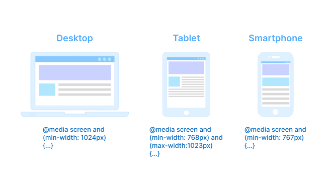
- Media Queries
- Outlook’s desktop versions do not support media queries, which are essential for responsive designs. This limitation means that responsive layouts must be approached differently, often using tables for layout structure.
- Custom Fonts
- ‘@font-face’: Custom fonts imported using ‘@font-face’ are not supported. Stick to web-safe fonts like Arial, Verdana, and Times New Roman.
					@font-face {
    font-family: 'Roche Sans Regular';
    src: url('../../fonts/roche-sans-roche-serif/Desktop/RocheSans-Regular.ttf') format('truetype');
    font-weight: 400;
    font-style: normal;
}
- Animations and Transitions
- ‘animation’ and ‘transition’ properties, including keyframes, are ignored by Outlook. Any animated effects will not display as intended.
					@keyframes fadeIn {
    from {
        opacity: 0;
    }
    to {
        opacity: 1;
    }
}

.element {
    animation-name: fadeIn;
    animation-duration: 1s;
}
Workarounds and Best Practices
Given these limitations, here are some best practices and workarounds to ensure your emails look good in Outlook:
- Use Tables for Layouts: Tables are universally supported across email clients, including Outlook. Using nested tables can help create complex layouts that render consistently.
- Inline CSS: Instead of relying on embedded or external stylesheets, use inline CSS. This method increases the likelihood that your styles will be applied as intended.
- VML for Background Images: For background images, consider using VML (Vector Markup Language) for Outlook. VML allows you to define shapes and images in a way that Outlook can render. Here’s an example of how to use VML for background images:
					<!--[if gte mso 9]>
<v:rect xmlns:v="urn:schemas-microsoft-com:vml" fill="true" stroke="false" style="width: 600px;height:400px;">  <v:fill type="frame" src="background.jpg" color="#ffffff" />
<v:textbox inset="0,0,0,0">
<![endif]-->
<img loading="lazy" decoding="async" src="fallback.jpg" width="600" height="400" alt="Background Image" style="display:block;" />
<!--[if gte mso 9]>
    </v:textbox>
</v:rect>
<![endif]-->
- MSO Conditionals: Outlook-specific CSS can be applied using MSO (Microsoft Office) conditionals. This helps you target styles specifically for Outlook without affecting other clients. Here’s an example:
					<!--[if mso]>
<style>
    .outlook-specific {
    width: 100% !important;
    }

</style>
<![endif]-->
- Fallbacks for Backgrounds: For background images, consider using a solid color fallback and including the image as part of the content using ‘<img>’ tags or VML for Outlook.
- Test Extensively: Always test your emails in multiple email clients, including different versions of Outlook. Tools like Litmus and Email on Acid can help automate this process.
- Keep It Simple: Sometimes, the best approach is to simplify your design. Avoid overly complex layouts and styles that are prone to rendering issues.
Conclusion
Designing emails that render well in Outlook requires understanding its limitations and employing strategic workarounds. While Outlook’s handling of CSS can be frustrating, adhering to best practices and thorough testing can ensure your emails are visually appealing and functional across all email clients. By staying informed about what works and what doesn’t, you can navigate the challenges of email design with greater ease and confidence.
Author Bio:

Pavan Pratap Patil
Principal Software Engineer - UX/UI-Digital Transformation
As a seasoned UI/UX Developer with 5 years of experience, I bring a wealth of expertise in front-end development as I dabble with technologies such as HTML5, CSS3, JavaScript, and Bootstrap. With a deep focus on creating responsive designs, I try to ensure optimal user experiences across diverse devices. I try to consistently deliver modern, high-quality web solutions commitment to staying informed of industry trends.