
Points of Discussion:
- Introduction to theming
- Pre-requisites
- How to work on it with SCSS
- Steps to be followed
1. Introduction to theming
Theming maintains the uniform look and feel of the webpage, and it includes the smooth use of colors, icons, fonts, animations, and page elements.
2. Pre-requisites
To do the theming, you don’t need many things but JavaScript or jQuery, HTML, SCSS, and Bootstrap.
3. How to work on it with SCSS
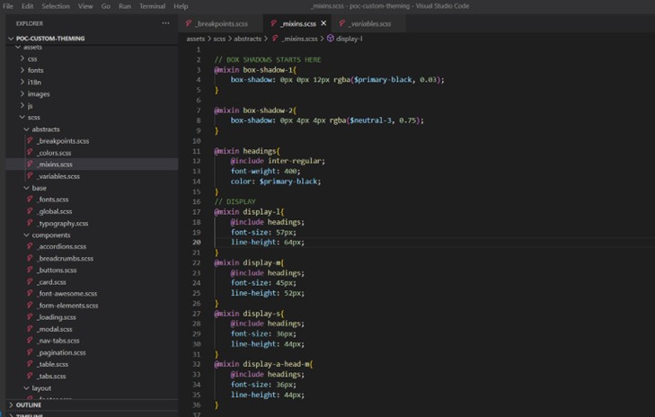
To get started on this, we need to prepare a folder structure and design utilities like the required colors, fonts, and a set of icons to be used in the theme. The mixins. scss file will have the custom mixins as are necessary for the music. In the breakpoints.scss, we will write media queries. All the fonts should be added to the fonts.scss file, global. scss will have the essential elements like body tag; typography will have all typographic scss for elements like headings, sub-headings, texts, paragraphs, and similar details. All bootstrap components scss will go in the separate files under the components folder. In the layout folder, we will keep the basic structure of the application, like header, footer, sidebar (if any), and the page layout elements like a sidebar or similar. The global. scss will have all the files included in it.
- In the colors file, we will be defining the colors
- We will define mixing for the box shadow, headings, title, body text, label, sub-headings, and paragraphs in the required sizes as per the theme
Let’s use them on the page. We need to divide the page into some components like the navbar, form, heading, sub-headings, accordions, buttons, and typography.
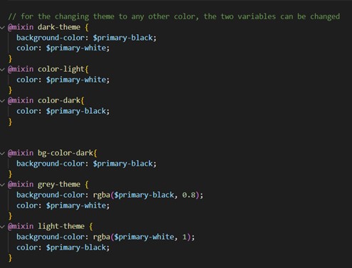
We will create two themes, the dark theme, and the light music. The class will be added to the body tag. And based on it, we will develop mixins and will use them later. The respective components mixins will be added to the separate files under the components folder.
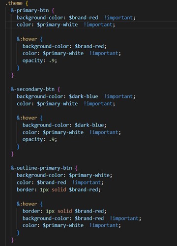
Regarding the colors we have added, $ brand red will be the primary color, and $ dark blue will be the secondary color. By considering these colors, we will be defining the components based on the mixins we have created. We will write the component’s SCSS in a separate file.
This is for the customization of the accordion.
Buttons – we will create the theme buttons like this and use them throughout the application.
Card – We need to categorize light and dark themes.
Modal – The models can be categorized into dark and light.
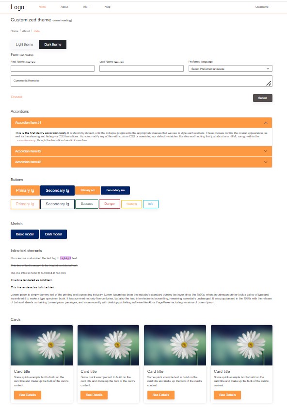
Let’s use an HTML file. Create an HTML file with essential elements like Navbar, breadcrumbs, some form elements, accordions, buttons, modals, typography, and Cards. And we will give the classes which we created for the respective components.
The page will be something like the one below, our primary color is #fd7e14, and our secondary color is #022366. The theme will be automatically applied to the component which we add into.