
Purpose of the article: The recent enhancements to the web UI aim to elevate user experience by introducing innovative features such as CSS nesting, dynamic viewport units, and complex queries using nth-of selection. These updates ensure smooth functionality across different browsers, providing users with greater design flexibility and an exciting, seamless interaction.
Intended Audience: UI/UX, UI developer, UI Designer, Web developer, Web Application developer.
Tools and Technology: CSS, VisualStudioCode
Keywords: CSS, Web UI, CSS Features, CSS Nesting, Dynamic Viewport Units, CSS Nth-of Selection, User Experience, Cross-browser Compatibility, Web Design Updates, Browser Compatibility, Responsive design, Web development, Design flexibility

Introduction:
Recently, Web UI has become even more awesome with new features that work smoothly across different browsers, bringing in a wave of excitement. Check out these 3 cool features that have just landed or are coming soon – they’re making the web experience even better!
CSS Nesting:
CSS nesting, a feature loved by Sass users and a top request among CSS developers for years, is finally making its way to the web platform. With nesting, developers can write code more efficiently in a concise, grouped format, minimizing redundancy.
CSS nesting differs from CSS pre-processors like Sass in that it’s parsed directly by the browser instead of being pre-compiled by a CSS pre-processor. Additionally, in CSS nesting, the specificity of the “&” nesting selector mirrors that of the :is() function. It is determined by the highest specificity found within the associated selector list.
This means that both constructs prioritize the most specific selector within their respective contexts.
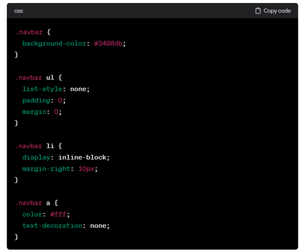
Old CSS:
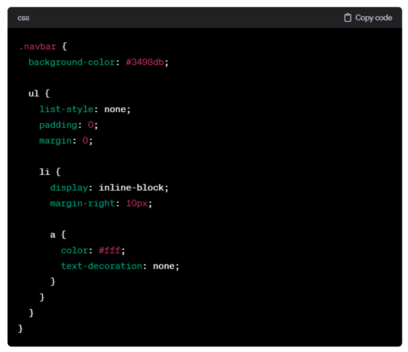
Nesting CSS:
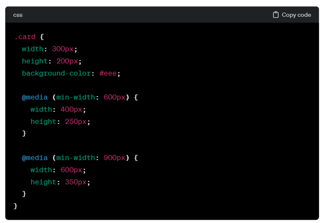
You can also nest Media Queries in CSS, allowing you to specify different styles for various screen widths within the same rule set. This enhances code organization and readability, making it easier to manage responsive designs effectively.
HTML and CSS example:
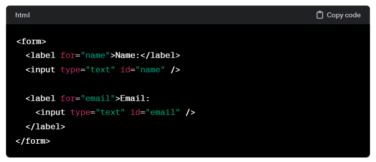
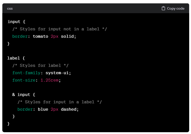
When nesting classes without the “&” symbol, the outcome will consistently be descendant selectors. By using the “&” symbol, you explicitly signify where the parent class should be placed, offering a more controlled and intentional result.
Dynamic Viewport Units:
Web developers face challenges achieving precise full-viewport sizing, particularly on mobile devices. Using 100vh doesn’t account for factors like retracting navigation bars, causing content to appear taller than intended and resulting in unnecessary scrolling.
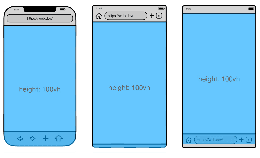
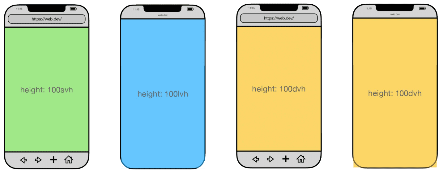
To address this issue, the web platform now offers new unit values, including (svh and svw) for the smallest active viewport size, (lvh and lvw) for the largest size, and (dvh and dvw) for dynamic adjustments based on browser toolbars. These units provide more precise control over full-viewport sizing, ensuring consistency across various devices.
Responsive viewport units adapt their size dynamically depending on the visibility of additional browser elements such as the top address bar or the bottom tab bar.
Complex nth-*Selection (nth-Of Syntax)
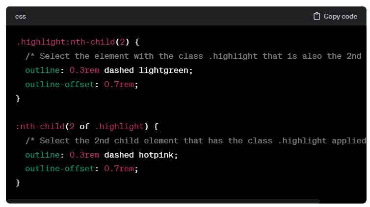
Now, the web platform offers a more advanced way to select nth-child elements. This advanced syntax introduces a new keyword (“of”) that allows you to use the existing An+B micro syntax within a more specific subset for searching.
When you use the regular nth-child, like :nth-child(2) on the special class, the browser picks the element that has the special class and is also the second child. On the other hand, :nth-child(2 of .special) first filters all elements with the special class, then selects the second one from that list.
Conclusion:
CSS nesting streamlines development by eliminating the reliance on pre-compiled processors like SCSS, offering a native and efficient solution within the web platform. This simplifies styling and enhances ease of use for developers.
The web platform’s advanced nth-child syntax introduces the “of” keyword, refining element selection for increased precision. This enhancement offers a more specific approach compared to regular nth-child usage, improving flexibility in targeting elements.
Keep abreast of the newest CSS and HTML developments at developer.chrome.com. Delve deeper into the latest updates with I/O videos, exploring additional web advancements.
References:
- https://developer.chrome.com/blog/whats-new-css-ui-2023
- https://developer.chrome.com/blog/whats-new-css-ui-2023
- https://developer.chrome.com/blog/css-wrapped-2023
- https://medium.com/navara/new-upcoming-css-features-2023-ba44d8a45993
- https://positivethinking.tech/insights/the-10-new-css-features-in-2023/
Author Bio:

Vrushabh Veerkumar UPADHYE
Principal Designer - UI/UX - Digital Transformation
I have experience working in a corporate environment as a front-end UI/Web Developer. Experience developing highly interactive web applications utilizing client-side technologies - JavaScript, jQuery, Material ui, Bootstrap, HTML5, CSS3, SCSS and Responsive design.